Ali Vural Ak Center for Global Islamic Studies' own Ann Birkelbach reviewed the “Bridges of Faith and Tradition” Exhibition for Maydan. The exhibit was on display at the Loudoun County Government Center from September 12 through November 4, 2016. Photo credits: Ann S. Birkelbach.
Tucked away in a small historic city not far from the nation’s capital lies a community exhibit attempting to build bridges between the indigenous American population and the more recent immigration of Muslim Americans. The exhibit is located in the modern low rise building of the Loudoun County Government Center dedicated in 1996. One enters the Government Center into a spacious grey marbled foyer. On the left-hand side of the foyer a Boardroom is located with two entrances. Between these two entrances lies a passageway where the gallery space is located called Gallery One. Gallery One is a space designed and dedicated to community art for the benefit of its citizens.
The gallery exhibit remained free, open to the public during Government Center hours, Monday – Friday 8:30am-5:00 pm and provided free covered parking a short walk through a green space to the Government Center. To get a better sense of the place and location, I took a moment to observe the exhibition cases located outside Gallery One. Like in most small American cities these cases publicize the city’s accomplishments, its partnerships, and its civic pride. Various awards, plaques and letters are displayed. Notably, Loudon has established partnerships, sister city agreements and Memorandum of Understandings with Korea, China, Taiwan, Germany and even a “town turning agreement” with the Karsiyaka municipality of Turkey. There are also two letters from the Department of the Navy thanking Loudoun County Fire and Rescue Department for their assistance during the events of September 11 –the turning point of our century which has had a lasting impact on America’s relationship with Muslim populations in the US and abroad.

An Eclectic Collection
The gallery space, 8-10 feet wide and about 15 feet in length, is compact but sufficiently large to display a unified theme of artwork. The space itself is punctuated by small alcoves made by square columns inviting the display of artwork and spotlights are strategically placed in the ceiling to highlight the works of art. Inside, on a small table, there is a letter size poster board ad for the exhibit and a few flyers and cards from the artists. There are no brochures of the exhibit and no mention about the curator or researcher who put the exhibit together.I was alone in the exhibit both times I visited on weekdays. The title of the exhibit sounded promising: “Bridges of Faith and Tradition.” This fueled my enthusiasm for making the trips out to Leesburg from Fairfax which is about a forty-five-minute drive under normal traffic conditions.
The exhibit contains twenty-one pieces created in various media and sizes by both male and female artists, amateurs, professionals, and even children. For the most part, each piece has a label detailing the title of the piece, materials and the artist’s name. In some pieces, a short explanation is given by the artist about the intention and meaning of the work. The exhibit contains a variety of media including photography, batik depiction, oil/acrylic painting, gouache and acrylic on board, oil on canvas, acrylic on handmade paper, water color, and even color pencil. The larger pieces are displayed together in one area of the gallery which include two mixed media works on canvas and one unusual piece engraved in wood. The subject matter of the artwork also varies greatly and the works do not seem to be organized in any particular manner. This gave me pause for thought about how I would discuss these works. I decided to approach the works as a visitor would view the exhibit.
The first piece, entitled “Ascension” is a cleverly executed batik depiction of the Dar al-Islam mosque in Abiquiu, New Mexico. Batik is a traditional wax resist process used in textiles across India and Southeast Asia. But in this case the artist created an image of a mosque using this process rather than abstract or floral designs. The second work hung just below the first one is named “Meditation” and is a nicely composed photograph of a Qur’an page and tasbih (a rosary used by Muslims). Moving onto the third work “Relaxed Company,” one is surprised, if not baffled, to find this kind of a piece in an exhibit which highlights faith and tradition. It is a naturalistic depiction of two buffalo on the great American prairie.

In the third work of art entitled “Ocean of Gratitude” we encounter an original piece made with spray paint and gold on canvas. This is the same artist that created “Ascension” and shows a similar vision of originality. The fourth work, “Still Life,” completes the set of works on one wall. This piece intends to depict table and café ware with a rosary artfully placed in the foreground of the work that might be found in a Muslim home. It is nicely executed in charcoal but again I am not sure if it merits being placed in an exhibition dedicated to faith and tradition. Then we come to a piece that can be easily situated within Islamic art. It is a floral medallion composition with a Qur’anic verse in the center. The background paper is a bit stark and some of the colors appear to be a bit too fluorescent. Unfortunately, the artist provides little information on the piece so the audience is left wondering what the meaning of the verse says. This artist has another piece in the exhibit that I will discuss later.
As I moved on from this partition of space I came upon a surprise; a piece which uniquely utilizes the trunks of palm trees as the vertical strokes of Arabic letters. The letters or trunks are rendered in a type of floriated kufic script.
“As I moved on from this partition of space I came upon a surprise; a piece which uniquely utilizes the trunks of palm trees as the vertical strokes of Arabic letters. The letters or trunks are rendered in a type of floriated kufic script.”The use of bronzes, browns and soft greens is pleasing to the eye. I have not seen a piece of work like this before and considered it one of the most original works in the show. It is also one of the largest pieces in the exhibit and the only one submitted by this artist. I felt the energy, effort and authenticity behind this artist’s work. And although the artist did not provide full information or a label explaining his piece, he did leave his audience with one fetching quote “Nations are elevated by their morality.”
Then we come to two more large pieces. Both pieces are works which fall into the category of “contemporary Islamic art” and are clearly done by a professional artist. The artist uses an intensity of colors not normally found in more traditional works. These works are expressive and emotional; they employ modern Western techniques found in abstract painting. The first work entitled “Peace” incorporates the traditional technique of zoomorphic calligraphy. The word peace, salam in Arabic, is placed in the center background in white and the last letter mim is calligraphed in the shape of the dove –a well-known symbol of peace in Western iconography. The right side of the work uses calm, cool smooth colors and the left side uses hot agitated colors with an eerie stream of blood color red flowing down the canvas.
His next work entitled “Mercy” uses even stronger colors and contrasts in order to evoke an image of primordial creation of the world and its anticipated destruction. His use of deep sea cobalt blues intersecting at the center with a jarring use of oranges is dramatic and powerful. One is beholden to study the painting for at least a while.

Photography and Calligraphy
Moving to another interior wall, one sees four more works which appear to be randomly hung together. The first is a photograph taken of the tops of Ottoman style minarets and dome with parts of the image photo shopped in cobalt blue. The photo is taken from an interesting angle but is not noteworthy otherwise. Then to the right is a work that garners our attention due to its bright fluorescent colors, comic-book style motifs and a large inscription of the word Allah, God in Arabic, is unexpectedly found at the center of the canvas. The Arabic letters are done in a large nastaliq informal script. What I found especially remarkable about this piece is the artist’s title, “Peace.” Equally remarkable is the description that follows: “It brings peace to see it and read it.” This is not what comes to mind at all when viewing this piece; one would rather think about images of Andy Warhol, bubble gum, and kiddie playschool –I found this work to be a bizarre setting for a calligraphed name of God.
Then, below the photography work is a traditional calligraphic composition in the Turkish style. This piece entitled “Light on Light,” is taken from verse thirty-five of the Chapter of Light (An-Nur) in the Qur’an and it is particularly well executed. The soothing olive green background works well with the black calligraphic composition in the center. Allah is rendered in one of the six classical scripts. The artist’s signature at the lower portion of the piece is calligraphed in the diwani script – a script that came later after the six classical scripts were already codified and developed in the secretarial offices of reigning empires. Of all the “traditional” works displayed in this exhibition this is one of the most successful.
The next work, “Pretty Woman,” is by far one of the most outlandish pieces in the exhibit. It is an intricately colored pencil depiction of a young woman’s face with flowers, birds and a butterfly in her hair as a headpiece. The artist gives no explanation of her work or how this work might fit in with the exhibition’s theme. Am I reading too much into the work when I ask are the birds, the butterfly and the flowers evocative of paradise? Is the artist trying to show their audience that Muslim artists too can paint portraiture? A few minutes later I come across another artwork, “Golden Girl,” which evokes similar questions. Just as in the “Pretty Woman” this Western salon portrait does not relate to Islam or the exhibit’s themes. The visitor is left wondering if the artists’ potential Muslim background is the only reason these two pieces were included in the exhibit.
But then, almost to make up for this outlier piece, we see an original piece done in water-color which takes us in by surprise and admiration. It is a beautifully calligraphed name of God with ascending letters in soft pastel colors.
“But then, almost to make up for this outlier piece, we see an original piece done in water-color which takes us in by surprise and admiration. It is a beautifully calligraphed name of God with ascending letters in soft pastel colors.”It is one of the few pieces that is able to convey a feeling and mood through its colors and shapes. Again, the artist is drawing from the zoomorphic tradition of calligraphy to make shapes out of letters. One could make these letters out to be seen as a ship. The painting divides its background into three fields. The first lower field is a soft sea green which slowly fades into a white center. In the center of the white space the name of God is written in soft red. The white center background then gradually turns into hues of calming blues. The entire piece evokes softness, peace and upward movement. The heads of the letters alif and lam look like faces turned upwards toward the blue-sky colors while the final position of the letter ha is perfectly aligned with the other letters. This is quite an effect given the fact that in Arabic orthography the letter ha stretches out horizontally unlike the vertical strokes of the letter alif and lam. One other interesting observation is that the letter ha in red closely resembles the image of the human heart. The piece is entitled “In Praise of God” and the artist writes in the label, “this art was inspired by the Qur’an ‘God is the light of the heavens and the earth.’” This is one of the most successful works in the exhibit in its execution, originality, and design. I would be more likely however to rename this piece “Ship in Ascension” or simply “Ascension.”

Next we come to a more traditional work of Turkish arabesque design. In the shape of a teardrop the piece is fairly small in size and is set against a Prussian blue background. What is most remarkable about this piece is that it was completed by a seven-year-old child. The artist could possibly be related to Layla Saad who entered three of the most original pieces in the exhibition. In fact, there seem to be several family connections throughout the exhibit.
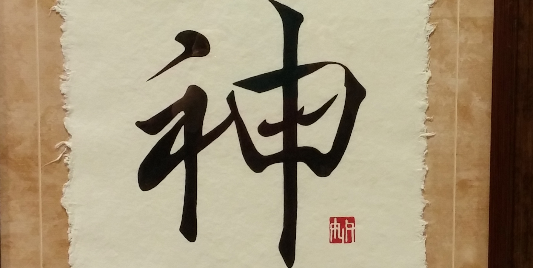
Just below this small composition is one of the most remarkable works in the entire exhibition and displays the great range of artistic ability of artist Layla Saad who created “Ascension,” “Ocean of Gratitude,” and now this piece, “One” [see the header image.] It is one of the most unique pieces of artwork I have seen – skillfully blending three languages and three styles of script. The artist tells us “This piece is a fusion of traditional Chinese and Japanese calligraphy with Arabic. The characters mean ‘God’ in all three languages- expressed is Kami in Japanese, Shen in Chinese and Allah in Arabic. Common to all three cultures is the technique of handmade paper, a technology that did in fact get passed to the Muslims through China. The title “One” certainly highlights the essential doctrine of oneness, unity or tawhid in the Islamic tradition.
But one can also gets the impression that the artists intention was more than this and that she is pointing to the fact that God is the same “one” in all cultures. Since I do not read Chinese or Japanese you are almost forced to study the work before seeing the word Allah integrated and even embedded with the two other characters. Alif serves as the longest vertical stroke at the beginning reading from right to left and the two lams serve as part of the first character in the two Asian scripts. While the letter ha serves as the second character, the artist effectively utilizes the shadda and diacritics also as part of the Asian characters! The clever use of three calligraphic scripts in three languages is quite astonishing. This work uniquely connects the Islamic tradition with the Asian world and brings to mind the verse in the Qur’an that identifies Muslim peoples as the middle people or the followers of a middle path. Indeed, the Islamic tradition and its peoples are a bridge between the East and the West – not only geographically but also in regards to Islam’s teachings.
Out of Place?
Yet another example of an artwork that does not quite fit in well with the exhibit’s overall theme is “Golden Girl,” a portrait of a girl with golden hair found typically in Western salon painting. The subject matter is not Muslim, the art of portraiture is not an Islamic art, and there is no mention by the artist how this work ties into the themes of faith and tradition. It appears this work was included because the artist was of Muslim heritage as in the case of “Pretty Woman.”
The remaining four works are clearly situated within the Turkish tradition of calligraphic composition. Two of these are created by the same artist, Sabra Lutz. They are both made with acrylic paint on board. Both pieces use traditional pious phrases the Basmalah and Alhamdulillah. The first is in the shape of an eight petaled flower. The colors are harmoniously in balance using blues, reds, greens, and yellows. The beige cream frame and matte board tastefully frames the composition. The calligraphy is done in diwani script; it reads Bismallah, a formula that is used commonly by Muslims to begin activities. Upon closer scrutiny, however, one notices that the calligraphy in both compositions are cut out and pasted onto the floral work. This does not surprise me as it is rare that an artist accomplished in design and illumination should also be a competent calligrapher. I did not care for this composition as much as the first. The silver frame is a bit jarring and cold next to the composition. Also, the particular tone of purple used to frame the work and the oranges used are too fluorescent for a traditional work of Islamic art and seem incongruous.
Then one moves onto the second art work, created by Maha Mahmood. This piece is more successful than her first piece that meets the visitors at the entrance. Again, the teardrop shape is used. The ornamentation design of acanthus leaves with blue and gold shading is nicely done with the artist’s signature carefully written in diwani script at the bottom of the work. The design is embedded on an attractive blue background in an ornate gold frame. It is strictly ornamental with no calligraphy or geometric patterning.
“The design is embedded on an attractive blue background in an ornate gold frame. It is strictly ornamental with no calligraphy or geometric patterning.”Because of its limited use of design the piece lacks interest and focus. The most successful compositions in Islamic Art use a careful balance of calligraphy, floral arabesque and geometry either as a design element or as its core design principle.
The piece by Salwa Medani is the last item on the exhibit. This last work, “Majestic Light” is her second piece in the exhibit. Unlike her first piece where she utilized a harmonious soft olive green as a background, here the background is a stark white combined with the use of luminescent pink. The calligraphic composition in the center, the Qur’anic verse, “Nurun ‘ala Nur,” a verse favored by traditional calligraphers, is well done. The composition is a sunburst design with projecting rays outward. Unlike her first piece where the calligraphy looks originally written, here the calligraphy is cut out and pasted onto the work.
A Laudable Initiative with Room for Improvement
I have two major criticisms of the exhibit: First, a number of the pieces featured in the exhibit do not have any relation to Islamic art or to the purpose of the exhibit, “Building Bridges of Faith and Tradition.” Not having had a personal interview with Larry Roeder, the PI for this amazing project, I am ready to extend the benefit of doubt and accept there may be reasons why he chose to include these eclectic works in the exhibit, Secondly, there is a lack of organization and thematic unity among the works which makes it difficult to come away with a guiding impression. Rather, one is left with a very mixed and uneven impression of the art work – some of them stand out as truly inspirational and others as completely irrelevant. In searching for a unifying theme to the exhibit I grouped the pieces into three categories; traditional, contemporary, and eclectic. In my judgment, out of the twenty-one pieces, four of them have no relation to Islamic art. The pieces are grouped together from all these categories often in contrast to one another. It is well understood in the museum world that the appropriate selection of art works and their careful arrangement is essential to the success of an exhibit. In addition, the use of different sized labels and fonts on each of the works gives an amateurish impression. Most labels, it appears, were created by the artists themselves which accounts for their lack of uniformity and polish.

It would not be an exaggeration to say that the title of the exhibit is more promising than what it delivers. On the other hand, the fact that this exhibit came into reality in a community and civic art setting, isas an accomplishment in itself. This was confirmed during my second visit when I delved deeper into the exhibition and spent more time reflecting on the pieces trying to determine the intention of the artists with the little information that was provided to me about the exhibit. The intelligence, creativity and authenticity of some of the works is evident and leaves one stimulated and asking for more. Furthermore, it may be that the eclectic mix of works points to a deeper issue facing Muslim artists today. When Muslims venture into the art world they are faced with a number of choices. They can completely take on the techniques and media of a tradition not their own ie the West; integrate Islamic art techniques, designs and blend them with Western ones; carry the chain of transmission of what was laid down by the great ateliers of Muslim craftsman preceding them; or come up with something completely original and new. These struggles on the part of artists to come to an “Islamic art” in our contemporary world has been highlighted through many conversations with various Muslim artists. I believe artists may experience an inner conflict or even confusion about how one creates works of art as a Muslim in today’s world. This issue clearly stands out in the exhibit.
Despite its drawbacks and unevenness, this exhibit manifests the best of the American grassroots tradition of coming together to build bridges between communities and faiths through the vehicle of art. I am hoping in some way this exhibit will help contribute to humanizing a population which has been unfairly stereotyped. On the whole it may be that this exhibit is not so much about teaching people about the religion of Islam but rather demonstrating to the public that Americans who happen to be Muslim are interested in and capable of creating works of art and are striving to find their rightful place in the melting pot of America as others have before them.
Indeed, what intrigued me so deeply about this exhibit – especially given the recent election results, Americans’ response to these results and the general atmosphere of Islamophobia in our country – is the hope and promise that our communities at the grass roots and civic level are able to connect everyday Americans and Muslims through art, beauty and wonder in a non-partisan and apolitical space. This is where we can have the most impact concretely. More of this activity needs to occur now across the span of the country. Leesburg, a historic city of Virginia, which housed the precious documents such as the Articles of Confederation, the Declaration of Independence, and the Constitution of the newly founded American republic when Washington D.C. was on fire, could not be a more fitting place to begin.